
5. Graphing
Creating Graphs
MATLAB has tools that enable the user to display data within visual forms such as tables, 2D, or 3D graphs to increase readability for the user.
2D Line Plots
Two -dimensional line plots can be created by the user with the plot command, which can be modified to incorporate colors, symbols, labels, and other aspects of the graph to ensure that the data is able to be read and interpreted by the user.
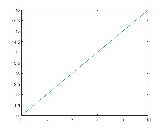
The plot function operates by plotting data assigned to a variable onto a graph. A simple way to graph the first-order line onto a plane is by listing the range of values for both the x and y coordinate which need to be graphed. The following example shows how the user could assign the range for the x- and y-axis, respectively, using vectors. This notation will generate a graph with a line running from the point (5,11) to (10,16). This is an easy way to generate a linear graph but most applications within scripts will be more involved than this.
>> x = 5:10;
>> y = 11:16;
>> plot (x,y)
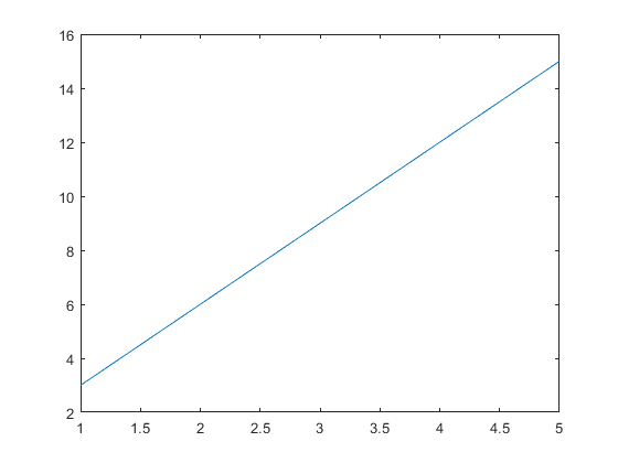
The above technique can be modified to make one variable dependent on the other. For example, if you have a set range of values (let’s say x = 1,2,3,4,5 for this example) and another variable that is a multiple of x (say y = 3*x for this example) the following code could be used to plot the above example.
>> x = 1:5;
>> y = 3*x;
>> plot(x,y)
Most applications of the plot function within MATLAB will incorporate an equation for one of the variables, thus creating the need for a plot to visualize the data. As a result, equations such as the y-value in the above example are much more prevalent than predetermined vector operations.
Another way to generate an evenly spaced vector to use when plotting a function is the linspace command. The linspace command selects the initial value, the final value, and how many values should be generated in between this range. An example is shown below, which represents a vector containing 100 values ranging between 0 and 10. The linspace command is used below in the example plotting two functions on the same graph.
>> linspace(0,10,100)
Several functions can be graphed within a single MATLAB, enabling the user to display several data sets more efficiently. This can be done by listing each set of variables in a series. For example, for the following variables, x, y, and x, the user would graph an x vs y plot and a x vs z plot in the same axis by using the following notation. This notation is one way the user can plot as many sets of variables as needed, though it is limited to 2D.
>> x = 1:6;
>> y = x.^2;
>> z = x.^3;
>> plot(x,y,x,z)
In order to place labels and titles in MATLAB plots, the following commands can be used to generate labels. Listing each of these commands after a plot command will add the labels to the graph. The following example is a general example of how to label the graph. Note that the font size can be modified by adding ‘FontSize’ followed by the desired font size after the title in the command.
>> xlabel(‘Name of Label’)
>> ylabel(‘Name of Label’)
>> title(‘Graph Title’,’FontSize’, 12)
>> legend(‘Name of First Plot’,’Name of Second Plot’)
The following image contains concepts addressed above within an actual MATLAB code to create graphs like the one represented in the above examples of commands.
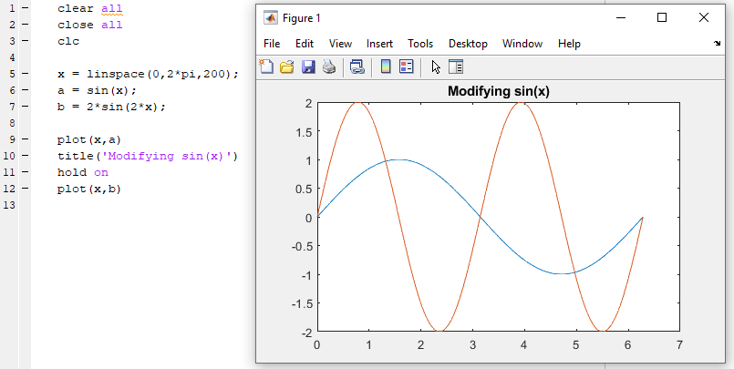
Another easy method to plot several lines on the same graph is easy within MATLAB. When writing code, use the hold-on command in between commands plotting each line. This will result in several lines being graphed on the same plot, which can be valuable when comparing data or wanting to save space when displaying information. An example is included below which also uses the linspace function to generate vectors for the x-axis of the plot.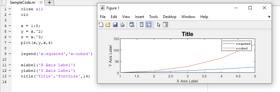
There are many methods available within MATLAB that can assist in producing graphs including scatter plots, line plots, or other non-linear display methods. To create a function that plots a scatter graph instead of a linear graph, use the function scatter in the place of the plot, which will only place points. This type of function is when the vector used to create the x-axis is important, as the number of points in the vector will dictate the number of points in the scatter plot. Additional replacements that can be used in place of the plot function include the bar function for bar graphs, the stairstep function for stairstep graphs, and the stem plot for stem graphs. An example of the scatter function is included in example 1 below.
Table 2.5.1 Line and marker types
| Specifier | Line Style |
| ‘-‘ | Solid Line, which is the default |
| ‘–‘ | Dashed Line |
| ‘:’ | Dotted Line |
| ‘-.’ | Dash-Dot Line |
| Specifier | Marker Type |
| ‘+’ | Plus |
| ‘o’ | Circle |
| ‘*’ | Asterisk |
| ‘.’ | Point |
| ‘square’ or ‘s’ | Square |
| ‘diamond’ or ‘d’ | Diamond |
| ‘^’ | Upward-pointing triangle |
| ‘v’ | Downward-pointing Triangle |
| ‘>’ | Right-Pointing Triangle |
| ‘<’ | Left-pointing Triangle |
| ‘pentagram’ or ‘p’ | Five-pointed Star (Pentagram) |
| ‘hexagram’ or ‘h’ | Six-pointed Star (Hexagram) |
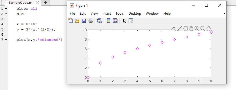
MATLAB plots enable the user to modify the physical appearance of the code to incorporate colors and shapes which will help depict data more effectively than a simple line. Being able to differentiate the physical appearance of graphs will be especially important when plotting several data sets in the same plan, which will be addressed shortly. Color or shape variations are listed at the end of a plot function within quotations. The following chart depicts a list of symbols and letters that can be used to create corresponding symbols or colors within a MATLAB plot.
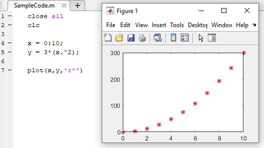
The following examples utilize colors and specifiers to create unique and more effective graphs. Notice that when using a vector, the specific values are visible when using a point notation as opposed to a continuous line. An additional detail that is necessary to make this code run is the period placed after the variable x in the equation. In order to multiply a matrix by an exponent, the period must be used to tell MATLAB to take each value in the matrix by the power. In this situation, each number from zero through 10 is squared and plotted in the graph.
Table 2.5.2 Colors for plotting
| Symbol | Color |
| r | Red |
| g | Green |
| b | Blue |
| c | Cyan |
| m | Magenta |
| y | Yellow |
| k | Black |
| w | White |
Other types of plots
MATLAB is a very powerful tool for creating plots. As engineers we can appreciate the need for creating a diversity of plots for displaying data and results in meaningful ways. Some plots that may be of particular use in this course are listed in the table below alongside the corresponding MATLAB commands.
Table 2.5.3 A sampling of plotting tools in Matlab
| Plot Type | MATLAB Command |
| Histogram | histogram() |
| Bar graph | bar() |
| 3D line plot | plot3() |
| Surface plot | surf() |
| Logarithmic plot | loglog() |
