38 Table of contents
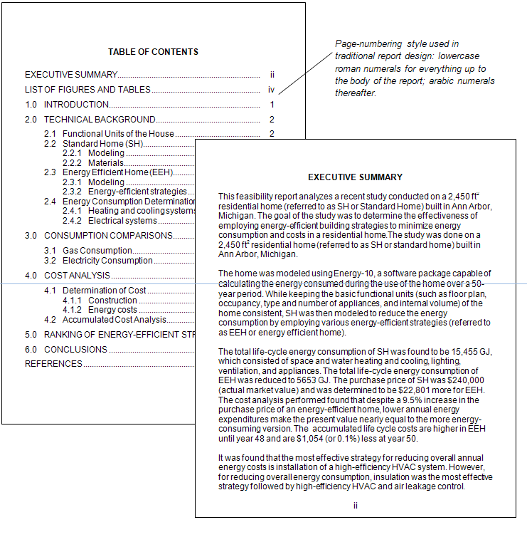
You are familiar with tables of contents (TOC) but may never have stopped to look at their design. The TOC shows readers an outline of the report, with page numbers where those sections and subsections start.
In creating a TOC, you have a number of design decisions:
- Levels of headings to include. In longer reports, consider not including only the top two levels of headings. This keeps the TOC from becoming long and unwieldy. The TOC should provide an at-a-glance way of finding information in the report quickly.
- Indentation, spacing, and capitalization. Notice in the illustration below that items in each of the three levels of headings are aligned with each other. Although you can’t see it in the illustration, page numbers are right-aligned with each other. Notice also the capitalization: Main chapters or sections are all caps; first-level headings use initial caps on each main word; lower-level sections use initial caps on the first word only.
- Vertical spacing. Notice that the first-level sections have extra space above and below, which increases readability.
Using the automatic TOC creator in your word processor can help you produce a clean, professional document. If you prefer to make your own, learn to use dot leader tabs in order to line up the page numbers correctly.
The wording in the TOC must be the same as corresponding captions in the text. See the example of a table of contents:


