47 Make Your Publication More Inviting Using Basic Principles of Readability: CRAP, continued
II. R is for Repetition: Repeat design strategies throughout your document to provide a sense of connection
The basic rule of repetition means that in any text, visual or textual elements that have similar functions should be formatted similarly in order to create continuity and show close relationships between the elements.
For example, newspapers have consistent ways of labeling different sections, like Sports, but there is also design consistency throughout the entire paper so you can tell that the section you just picked up belongs to a particular newspaper. USA Today in particular is notorious for its consistent repeated color coding and design.

On a smaller scale, in a resume, most applicants use bullet-pointed sections to list their job duties. “Repetition” in this context means that all these bullet points should be formatted identically: the same font, size, line spacing, and indentation. Each group of bullet-pointed items should be the same distance from the text above and below. The bullet points themselves should be exactly the same shape and size. This can be a lot of things to keep track of!
Repetition also applies to styles like MLA or APA. All titles are centered. All page numbers are in the upper right-hand corner, after your last name and a single blank character space. The same typeface is used throughout the paper. All paragraphs have exactly one empty line space between them. And so on.
Repetition means that every line classified as a “headline” should look like a headline, and headlines formatted to look alike can be identified as headlines with a similar function in the text. The same principle applies to body text. Fonts should not change without a reason. Lines, logos, and other graphic/visual elements should be formatted consistently. This repetition provides a sense of order and continuity that makes your document more readable and professional looking.
Since managing the formatting of multiple elements by hand can be difficult, many software programs provide templates—ready-made layouts into which you can plug your text and photos and thereby produce a variety of documents with a consistent look and feel. Microsoft Word, for example, also allows you to set Styles that will keep formatting choices like size, font, and style (bold, italic, etc.) the same for blocks of text with the same functions (body text, headlines, bullet points, subheadings).

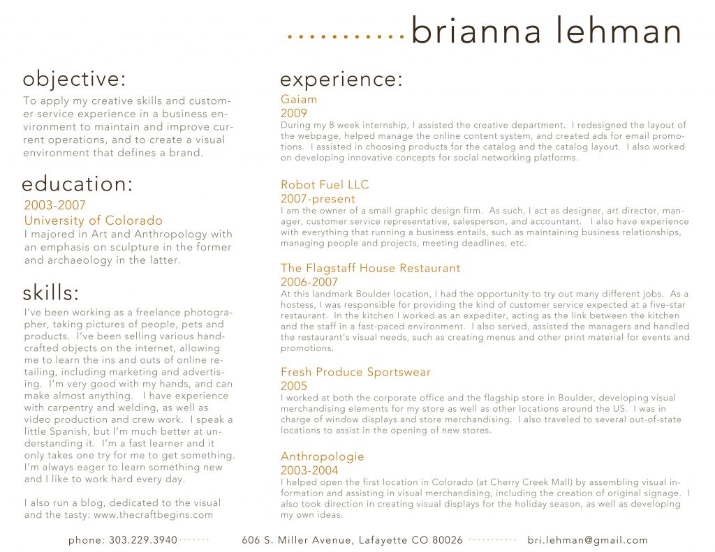
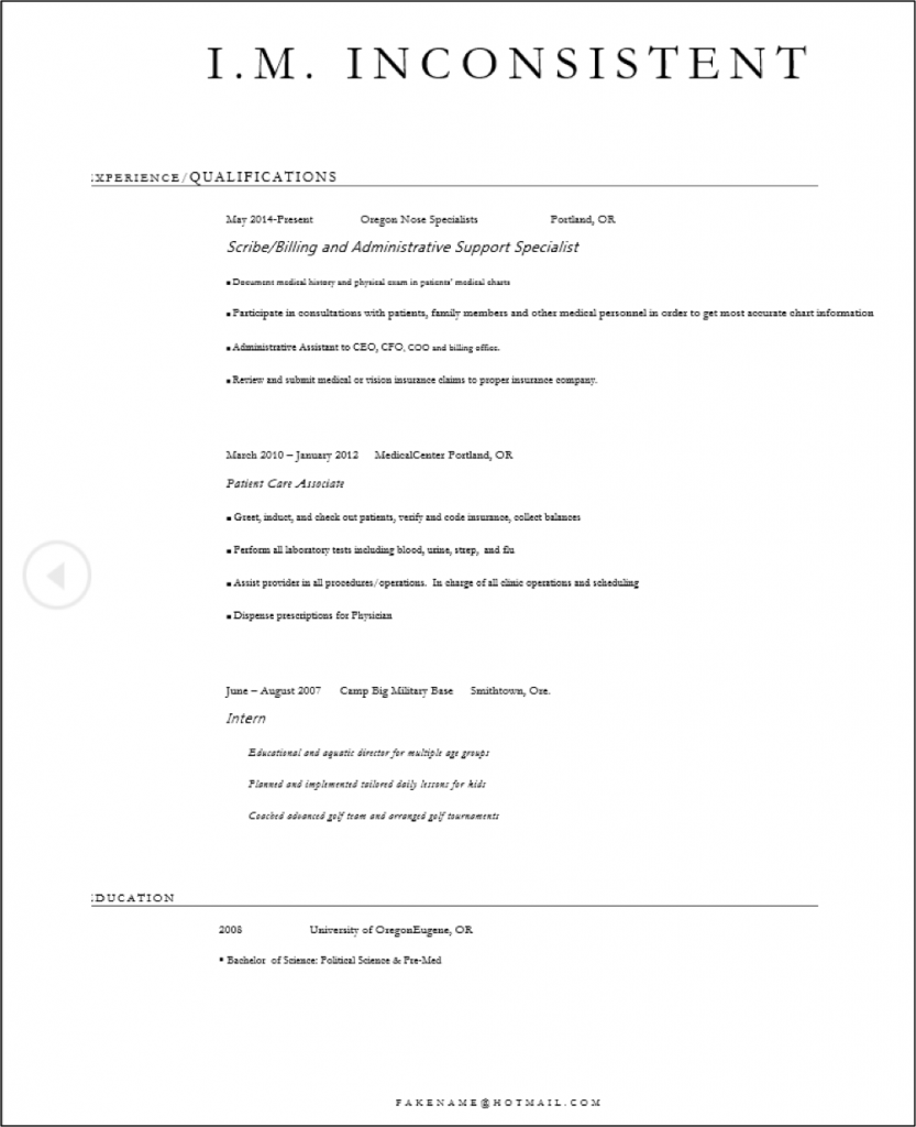
Templates for newsletters, resumes, and PowerPoint presentations ensure that basic design elements like font size/style, color, image size and alignment are consistent from page to page. Templates provide a quick, easy way to solve repetition issues. Look at the difference repetition makes in even the most basic of resumes, for example. Contrast the two below.
Figure 31: Whatever else you think about the design of this resume, choices made for typefaces,
size, position, and indentation are consistent. Each section is laid out identically.
Image Credit: brianna.lehman, resume, CC BY 2.0
Figure 32: This applicant has made inconsistent line spacing, typeface, alignment and indentation, and type size choices.
Image Credit: Author.


