48 Make Your Publication More Inviting Using Basic Principles of Readability: CRAP, continued
III. A is for Alignment: There should be a clear, deliberate arrangement of items on a page
Alignment can refer to text, as in the left-aligned body text required in MLA style. But in document design, it means much more; it refers to how the entire document is arranged. Most designers align all their content to some sort of a grid or pattern, creating a distinct, intentional arrangement of items on a page or screen. They use plenty of white space to cushion the items, which makes higher-contrast items “pop.”
Imagine you’re hanging 20 pictures on a wall. You probably should not just throw them up there randomly. You might measure and equalize distances between items, put unusual items in certain places (like in the center), or put similarly shaped or sized items together. This will provide a sense of order to your arrangement of the items.

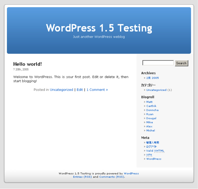
Software packages often allow you to draw lines or use an existing invisible grid to which you can “snap” items like images, blocks of text, or graphics. Templates do the hard work of arranging items on a page (or screen) for you. That’s why so many people use tools like WordPress, Illustrator, Publisher, Word, and PowerPoint—they allow you to arrange items easily, without the hard work of lining everything up by hand.
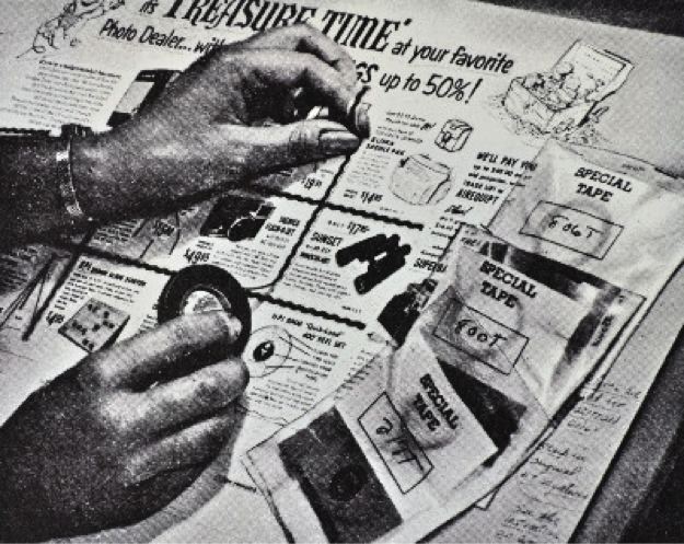
Newspaper and magazine layout artists once used various kinds of tape, contact cement (rubber cement), or wax adhesives to stick cut-out headlines, text blocks, photos, and ads to a page, just to produce a daily or weekly newspaper. To line up text and image blocks, they used wooden or metal rulers, graph paper, and T-squares. It was slow, tedious work. And rubber cement smells. The digital publishing revolution did away with all that. Most people who’ve spent half the night squinting over a yearbook layout that just won’t line up are glad about the changes.


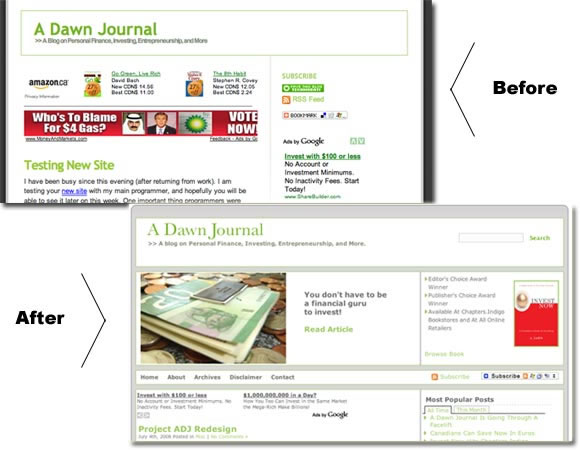
Still, alignment problems have not all been solved in the digital era. See for yourself some of the results of less deliberate alignment vs. controlled, arranged items on a screen, for example by visiting What are some examples of bad web design?

Learning how to arrange text and images artfully on a page takes tons of time, not to mention a whole email inbox full of user feedback, collaboration, thought, and hard work. This chapter will only acquaint you with some of the most basic elements of design. Perhaps after reading this chapter, you’ll start seeing CRAP wherever you look.

